University of Illinois Design System
Overview
At Illinois, feedback to the Web Implementation Guidelines Group (WIGG) highlighted a key user concern regarding our theme’s focus states. A user had issues determining when they were on links using keyboard navigation.
I, too, had recently experienced similar difficulties while taking an accessibility course, challenging myself to use the keyboard extensively for navigation.
Given the University’s commitment to accessibility leadership, such feedback was critical and couldn’t be ignored.
My Role:
UX Designer
Tools:
- Figma for designs
- HTML/CSS for testing
- Microsoft Teams
Target Audience:
Keyboard users
Testing Audience:
- IT Accessibility Liaisons
- Accessibility mailing list
- Explore with Hadi members
- DRES students
Plan
Although there were no stringent timelines, the team’s primary objective is to enhance the focus states beyond the minimum set by the WCAG 2.1 AA accessibility guidelines. Our task involved:
- Collaborating with the branding team to generate a few color options.
- Conducting an A/B test to ascertain if the university community preferred a traditional dashed outline or a more innovative approach akin to leading accessible sites like uk.gov and WCAG.
- Broadening the focus state scope to include images, buttons, and form elements – a task we’re actively pursuing.
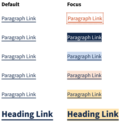
Color combinations for focus states, that we took to the branding team.
Test
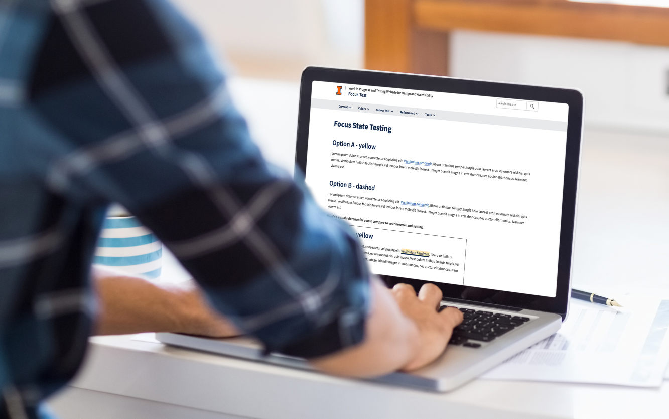
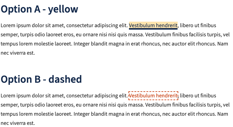
To facilitate the A/B testing, I decided to code the prototype in HTML, offering a more accessible and user-friendly experience for keyboard users than a Figma prototype currently offers. We proposed two alternatives for users to evaluate: a yellow highlight with a thick underline and an orange dashed outline.
Challenges arose in effectively communicating our message to the target users without marginalizing anyone. To address this, we tested multiple feedback form versions to ensure we posed the right questions. Using Teams, we rolled out a web form for feedback collection after users had tested the new focus states.
Results
The feedback was enlightening and varied:
- A considerable number found the yellow version more distinguishable than the orange one.
- However, issues with the underline obscuring some characters were raised.
- Guy H, an Accessibility Consultant, advised that the underline for option (A) be slightly lower, suggesting a 0.3em text-underline-offset in CSS, to cater for most fonts.
- Michael M from the University flagged that the thick underline could obscure parts of certain letters and suggested a potential CSS solution.
- Some participants noted browser-specific issues, while others came up with innovative suggestions like using reverse text or tweaking the hover state’s appearance.
Ultimately, the feedback underscored the need for continuous iterations to perfect the focus state design, ensuring the University of Illinois remains a beacon of accessibility.
See the tests in action
View these links to the HTML testing site we are using.
Current Focus State
Design looked at color options with branding
Survey sent to keyboard users
Implement feedback and test again