2022-23
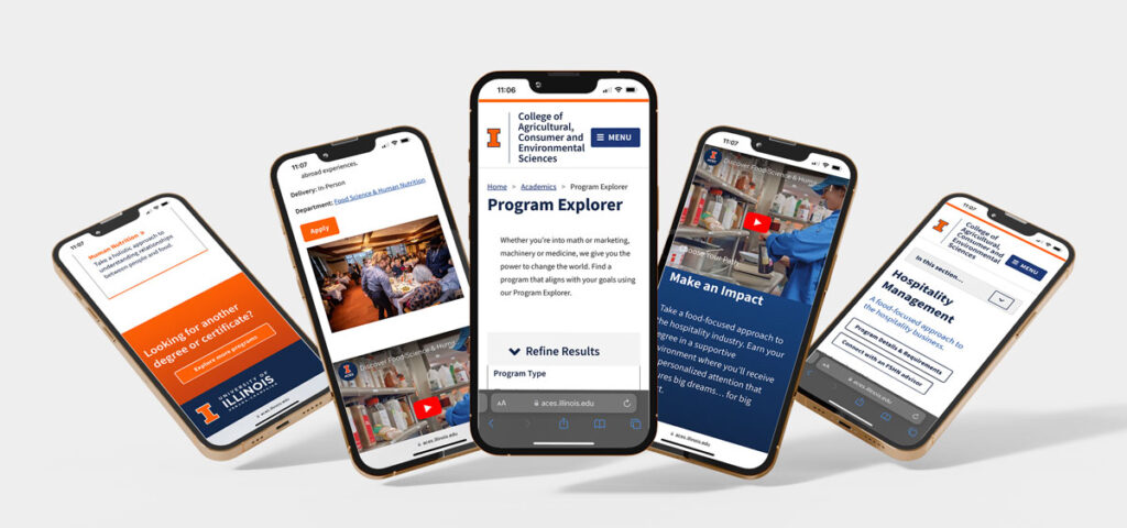
aces.illinois.edu/academics/program-explorer
Objective
Address the rapidly expanding list of majors, degrees, and certificates that have outgrown a simple list format, causing user navigation challenges.
Problem Highlights:
- Decision paralysis due to numerous choices.
- Absence of filtering and sorting capabilities.
- Over-dependence on “Learn more” buttons, leading off the main site.
The previous solution used accordion-style categories by degree, complicating navigation.
The Solution
Developed a responsive Drupal content type, allowing users to filter and sort through the available ACES offerings, prioritizing mobile navigation and optimal accessibility.
My Roles
- Project Management
- UI Design
- WCAG Compliance
- User Experience Design and Research
- Testing
Tools
- Adobe XD
- Slack
- Drupal
- Optimal Workshops Testing
Teammates
- Drupal Developer
- Content Strategist
- UX Lunch Club Members
Accessibility Strategy
Approaching this project with an accessibility-first mindset.
A deep focus on accessibility ensured:
- Limited animations for ease of interaction.
- Disabling autoplay for videos, with subtitles provided.
- WCAG 2.1 AA standard compliance in color contrast, including hover and focus states.
- Font styles that were scalable and legible.
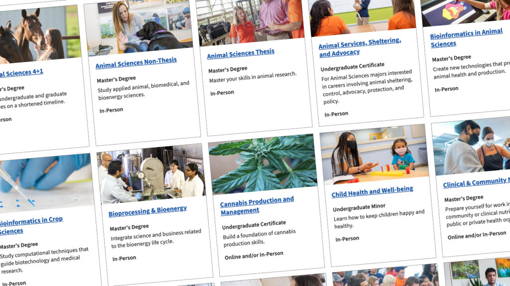
- Thoughtfully chosen images with precise alt-text descriptions.
- Keyboard-friendly designs, ensuring a logical reading order and functional focus states.
- Inclusivity-driven content and layout for an optimal user experience.
Discoveries
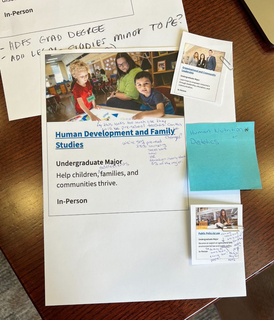
Our tests unveiled areas of enhancement. By treating each card as a singular link, we reduced the reading time for screen readers. Recognizing and communicating the number of results to users optimized their browsing experience.
UX Research
Optimal Workshop user testing
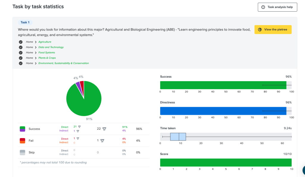
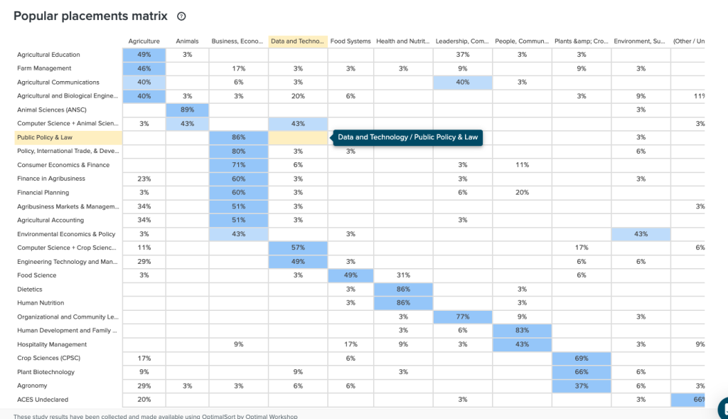
Extensive user testing with Treejack testing honed our program naming strategies, academic department categorizations, and search term definitions.
Initial List of Topical Categories
- Animals
- Plants & Crops
- Food Systems & Nutrition
- Health & Nutrition
- Natural Resources & Conservation
- People, Communities, & Families
- Policy, Law, Economics
- Sustainability & Environmental Stewardship
- Technology
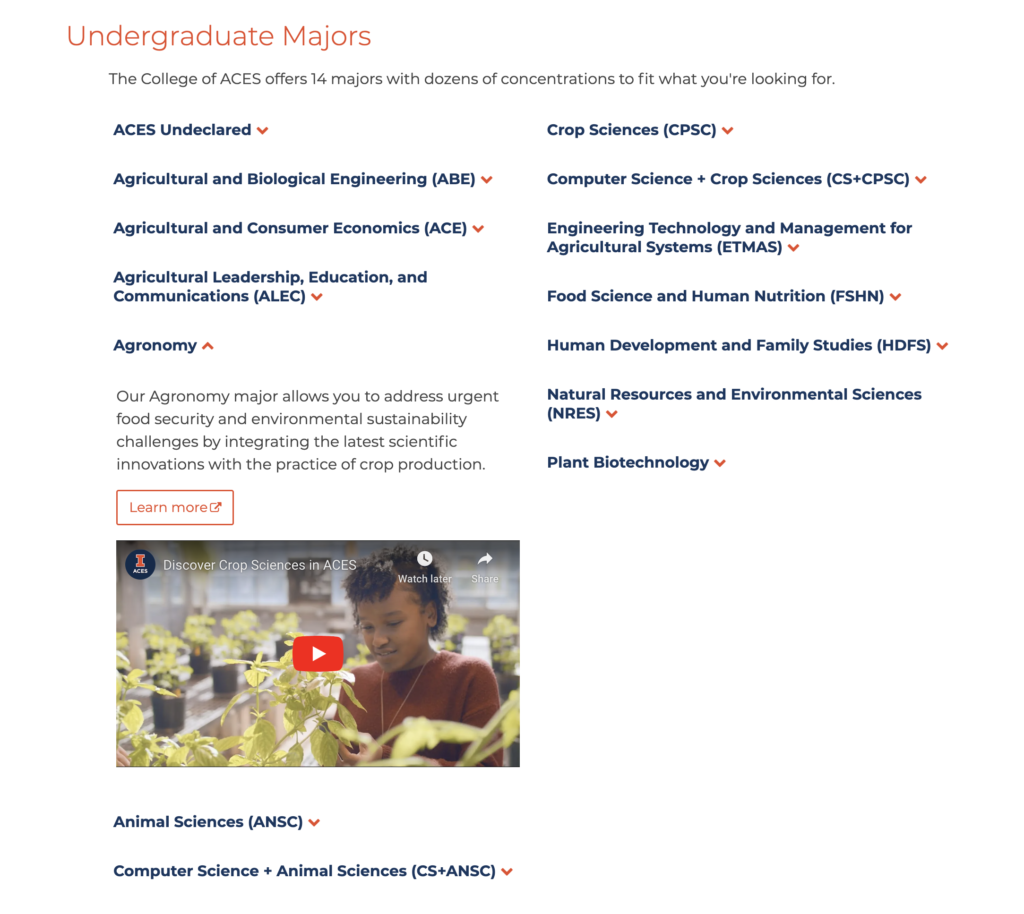
Final List of Topical Categories:
- Agriculture
- *Animals
- Business, Economics, Policy and Law
- Data and Technology
- Food Systems
- *Health and Nutrition
- Leadership, Communication and Education
- *People, Communities, and Families
- *Plants and Crops
- Sustainability and Environmental Sciences
*Topics stayed the same throughout testing.
Feedback Loop
Engaged staff and department heads in card sorting exercises, gleaning insights into information architecture and encouraging a collective stake in the project’s success.


Content Strategy
Employed a multi-view system using the same data set, minimizing redundancy, ensuring consistency, and streamlining updates.

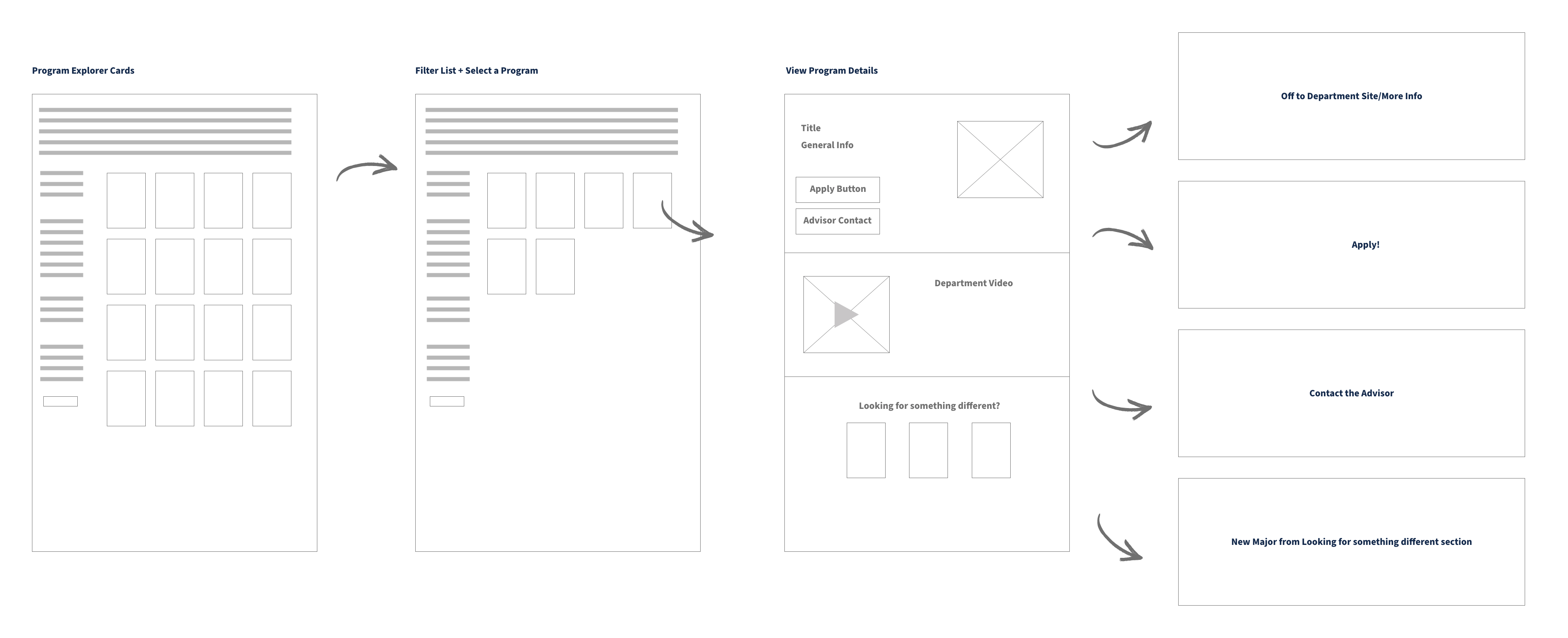
Prototyping with Figma
The user journey was mapped, ensuring a fluid, intuitive experience right from exploring programs to diving deep into specifics.
Figma Prototype
Design Process Overview
Starting with the fundamental 5Ws, the design strategy revolved around user-centric solutions. Research engaged college recruiters and advisors, harnessing insights from front-line experiences.
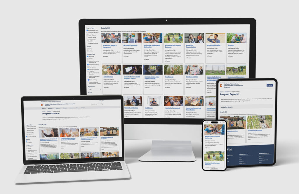
Final Result:
The revamped ACES Program Explorer is a blend of aesthetics and functionality, fostering a seamless user experience, aiding students in navigating the expanding world of ACES.
Iteration:
As with all digital platforms, the journey doesn’t end. Testing, refining, and continuous updates ensure the ACES Program Explorer remains a pivotal tool for students.
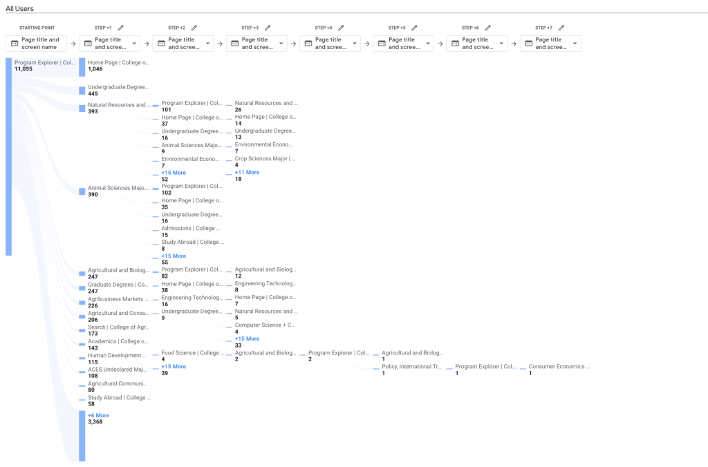
Here’s a screenshot of sample analytics taken after the product was built to see if users are going back to the explorer or clicking the similar major cards.