University of Illinois · 2020–2023
Illinois Digital Design System
The university had print-focused brand standards, but no digital design system. I built the v1 foundation and component library that became its first, then helped govern the cross-campus community that kept it spreading after I left.
Snapshot
- 5
- People on the College of ACES web team
- 3
- Cross-campus groups led
- Role
- Director of Web Development for the College of ACES. The design-system work ran alongside that role, through the university’s cross-campus web governance group.
- Team
- A five-person web team at the College of ACES. The cross-campus groups were separate and voluntary, with membership that changed continuously and ran between six and twelve people. A front-end developer named the tokens and built the production components.
- I owned
- The v1 design foundation and its prototypes: buttons, header, hero, quote, statistics and image-feature components, accessible color guidance and focus-state designs. The Adobe XD library, and the Figma rebuild after it. The training, workshops, documentation and Figma enablement designers worked from.
Problem
The university had print-focused brand standards, but no digital design system
Before WIGG, teams had brand guidance for logos, colors, and type, but no shared components, no shared code, and no web-accessibility guidance. Colleges copied the main university site or improvised their own patterns.
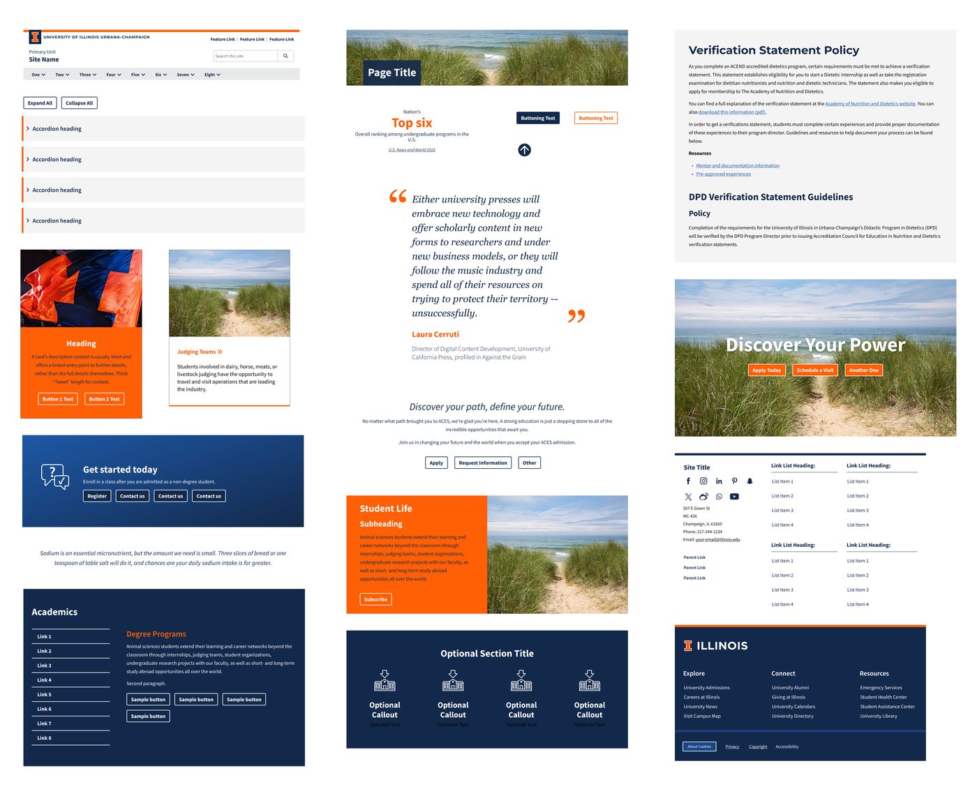
The illinois.edu domain covered university and college sites, departments, centers, and individual faculty, class, and student sites. Prospective students could encounter very different experiences depending on where they entered. Teams repeatedly rebuilt headers, heroes, quotes, statistics, and image features.
Accessibility expertise did not sit in every web-development team, and any unit could launch a site. That made accessibility hit or miss. The system needed to give teams clear, prescriptive guidance they could use without a specialist in the room.
Leadership wanted a more cohesive, accessible web presence. But in a federated university, no central team could simply mandate a new standard. The challenge was making the accessible, on-brand choice easy enough that autonomous teams would choose it.
Success
Success meant teams chose a standard no one could require
I counted shared-system use on university- and college-level sites, where the standard was most visible. That count could show use, but not whether the system reduced duplicated work or accessibility defects.
Role
I built the foundation that other teams could extend
As Director of Web Development for the College of ACES, I built the v1 design foundation and led the core design work.
My direct contributions included:
- the buttons, header, hero, quote, statistics, and image-feature components
- the Adobe XD component library and prototypes, later rebuilding the base system in Figma
- accessible-color guidance and focus-state designs
- training, workshops, documentation, adoption support, and Figma enablement for designers
I designed the foundation and the prototypes. A front-end developer named the tokens and built the production components.
Collaboration
Shared governance gave teams a way to improve the system together
I built the component library alongside WIGG’s review process that let it evolve across campus.
I worked with designers, developers, accessibility and content specialists, brand partners, and university stakeholders through the Website Implementation Guidelines Group. I led the Design, Drupal and WordPress groups and co-led the five-member steering committee, within a community of roughly 175 people.
- Propose. Teams brought patterns and questions forward.
- Review. Cross-functional partners tested the guidance against real use.
- Prioritize. The steering group focused the shared work.
- Release. Documentation and training helped teams put it to use.
I paired that process with workshops, office hours, documentation, and Figma training so designers had something practical to work from.
Approach
I started with the patterns teams kept rebuilding
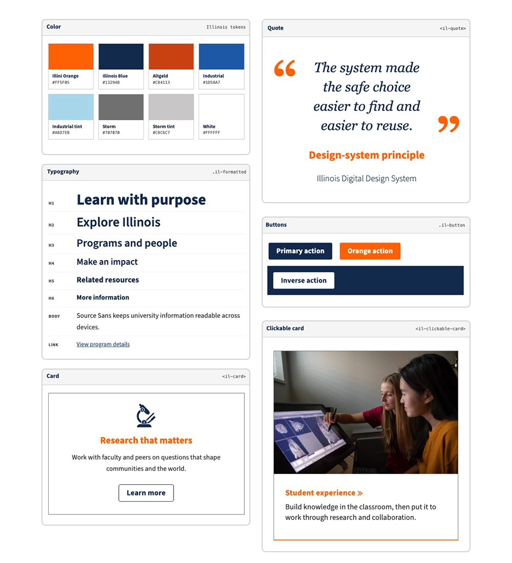
I prototyped the page patterns teams rebuilt most often, documented their responsive layouts and interaction states, and tracked them in an inventory. A front-end developer turned those decisions into production components that WordPress and Drupal teams could use and extend.
Component library
The variations were drawn before a team needed them
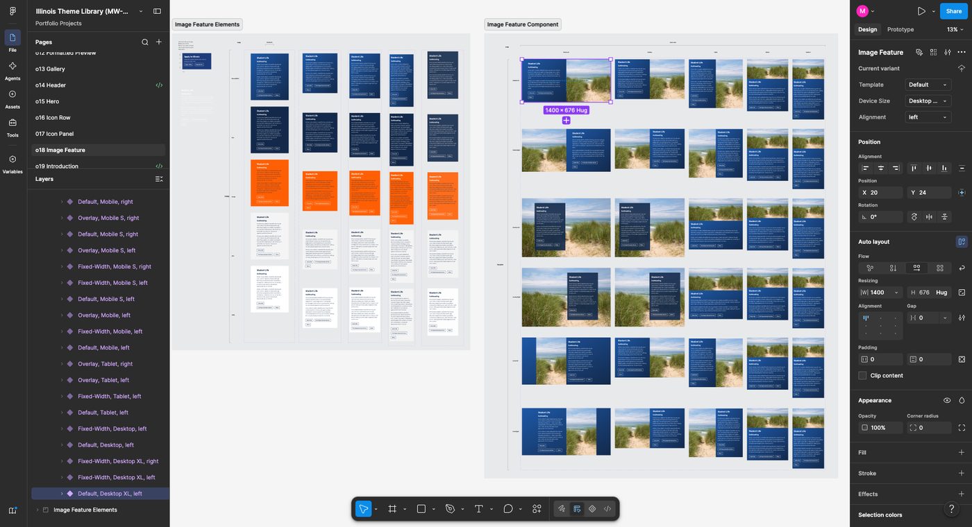
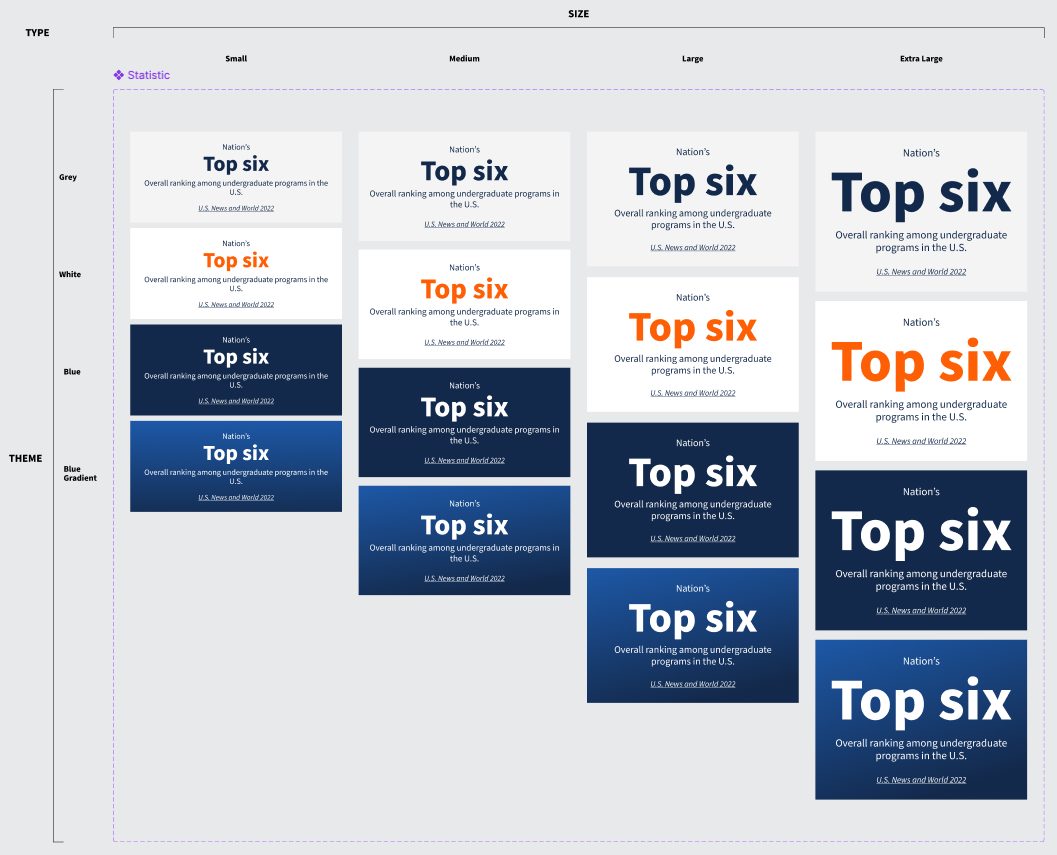
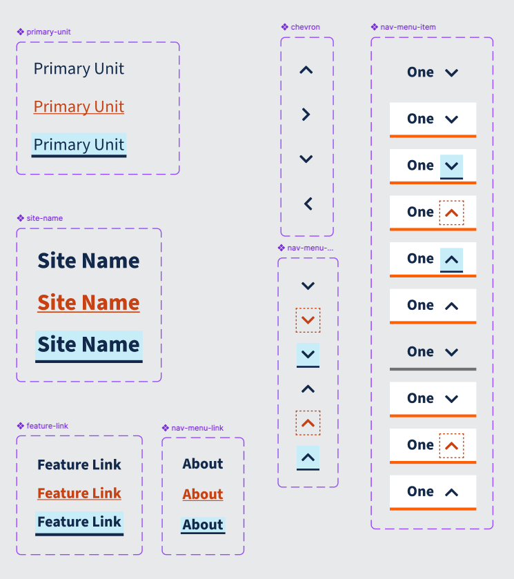
Variation was built into the component model rather than left to each team. What a component looked like at another size, in another theme, or on hover and focus was drawn and kept in the library, so a developer did not have to guess what an interaction looked like.
See the documentation examples
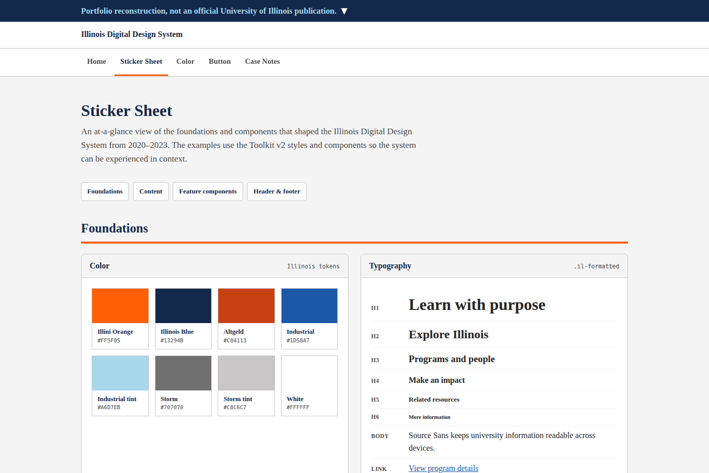
Browse the sticker sheet
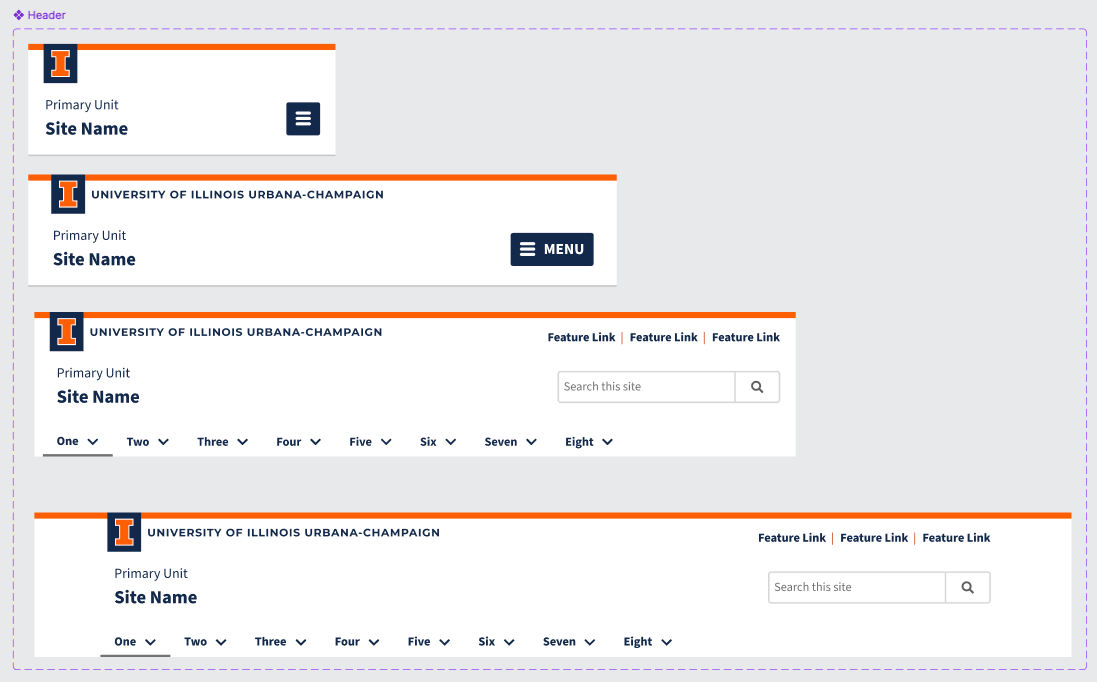
Foundations and components in one view, from color and type through the campus header and footer.

Try the button prototype
The color, hover, focus, disabled, and accessible-name decisions underneath the component.
Tradeoffs
The system had to make the safe choice practical
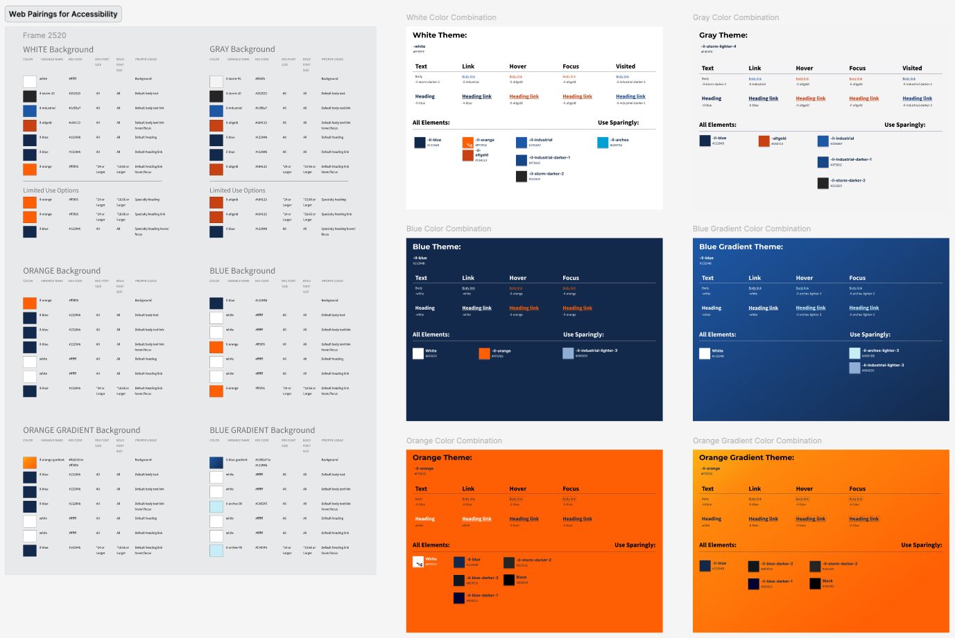
I made accessibility part of the component system from the beginning. Brand was involved from the start and was a major stakeholder, with particular expectations for Illini Orange. That color is central to the university identity, but it fails contrast requirements as text on white. Because accessibility expertise was uneven and any unit could launch a site, I documented approved color combinations for each theme and designed focus states that made the safer choice clear without requiring contrast math or a specialist review.
The system needed to meet teams where they worked. The shared component library gave both WordPress and Drupal teams something they could use and build on top of, without requiring every unit to change platforms. The tradeoff was less central control, so the design foundation, documentation, and reusable component model had to carry more of the consistency work.
Collaboration mattered more than familiar tooling. The work began in Adobe XD because the university had licenses, but decentralized IT and versioning made shared work brittle. No one was using Figma, so I taught myself the tool, rebuilt the base system there, and taught other designers how to use it.
Outcome
Adoption kept growing after I left
- 0 → 5 → 14
- no shared digital design system before this work; 5 of 17 sites using it when I left; 14 of 17 when I checked again in September 2026
WIGG was the catalyst for that growth. It kept the work coordinated across a fragmented university. Both counts used the same 17 sites and the same definition of shared-system use.