College of ACES, University of Illinois · 2022–2023
ACES Program Explorer
I designed and led an interest-based Program Explorer that helped prospective students browse a growing academic catalog without needing to understand the college’s department structure first.
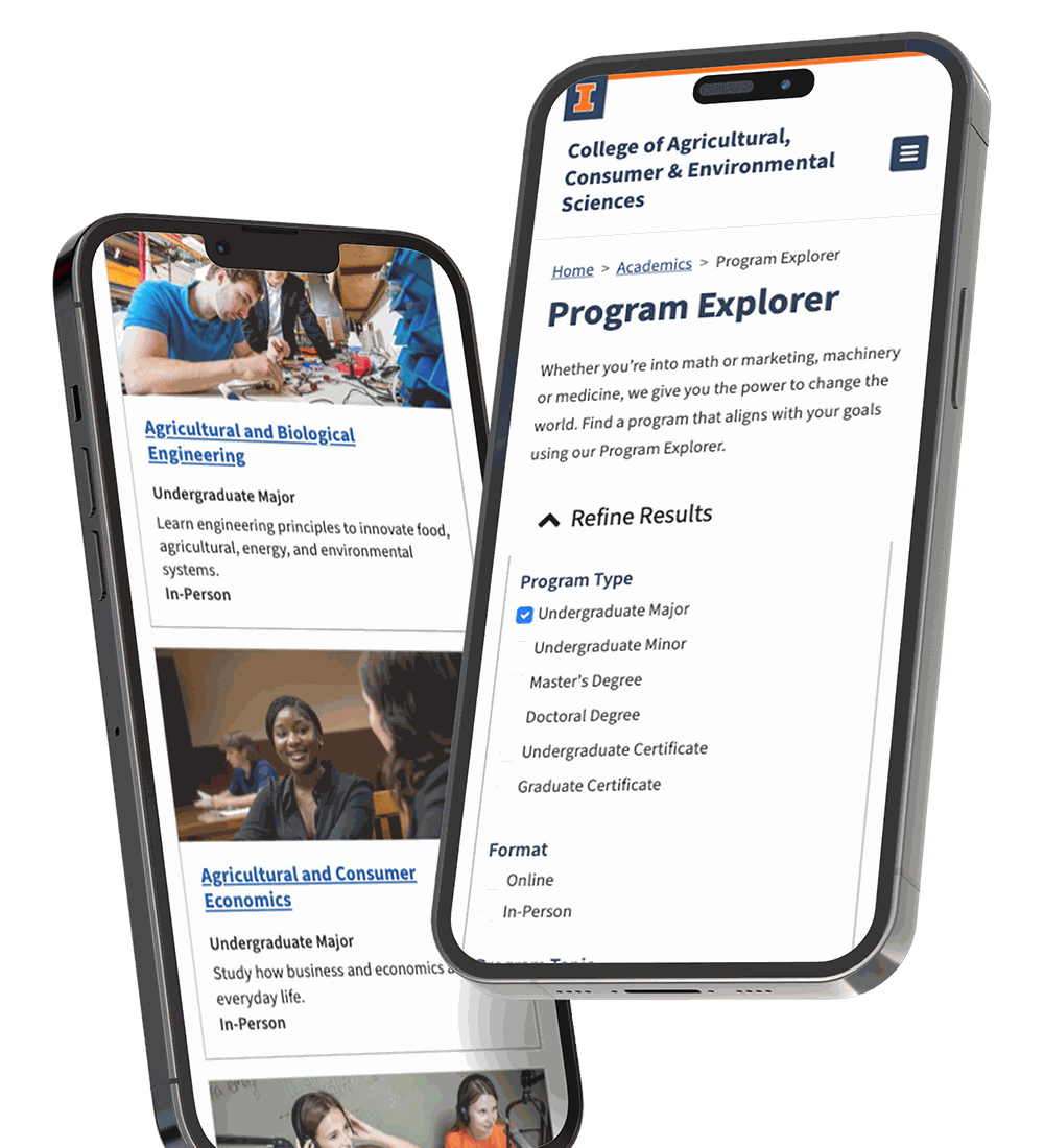
Snapshot
- 9
- Departments
- 126
- Program options
- 16 grew to 43
- Certificates
- 6-8
- Months to launch
- Role
- UX and product design lead. There was no formal product manager on the project.
- Team
- Two engineers, a content-focused UX designer, and a graduate assistant.
- I owned
- Research framing, the information architecture, interaction and visual design, the Drupal content model, and direction of the build.
Problem
Students needed an interest-first way to navigate a growing catalog
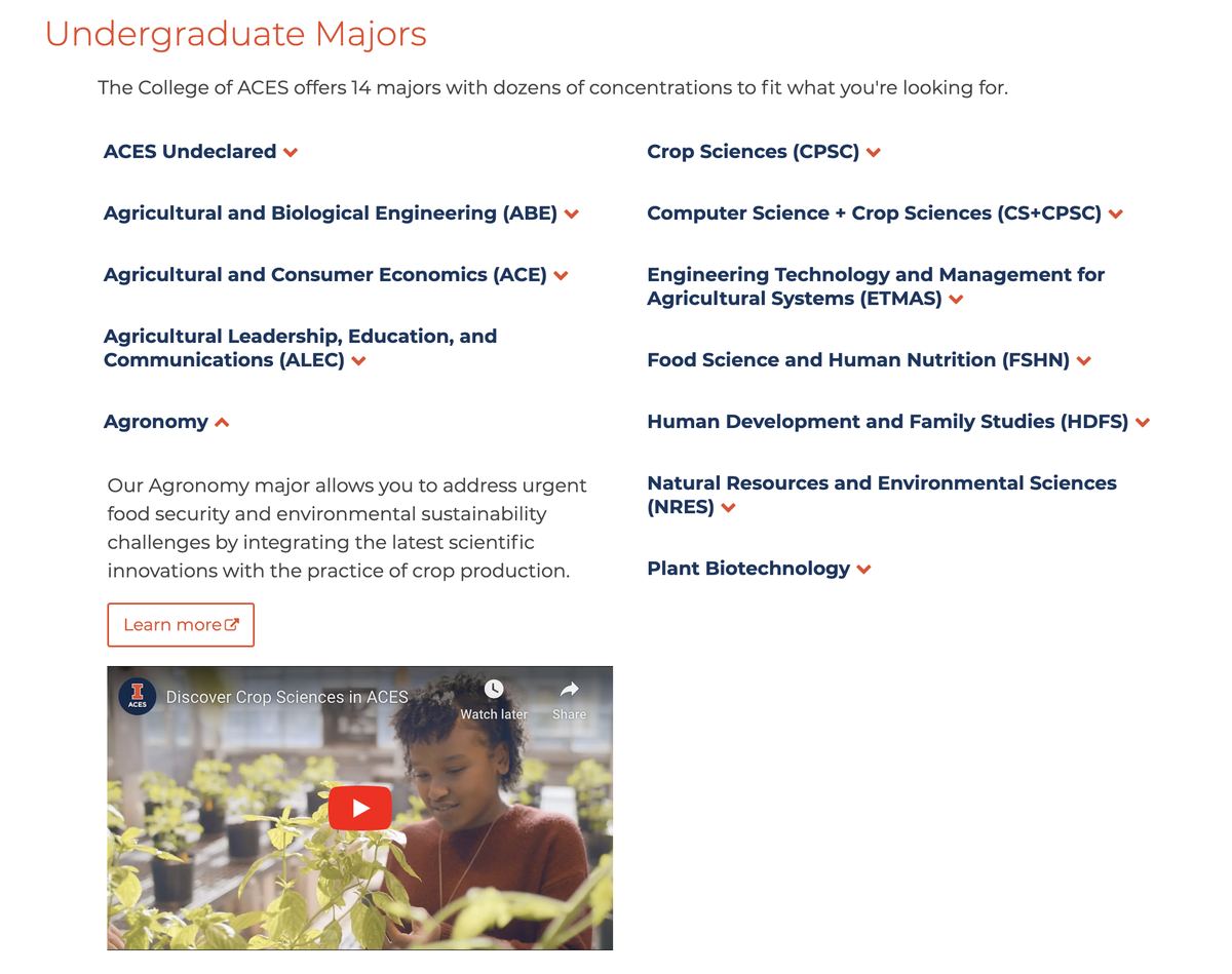
New online courses could stack into certificates and graduate programs, and the catalog kept growing. The only way in was an alphabetical list of departments. Admissions kept hearing the same thing, and so did we at in-person recruiting events: prospective students described what they cared about, not which department owned it.
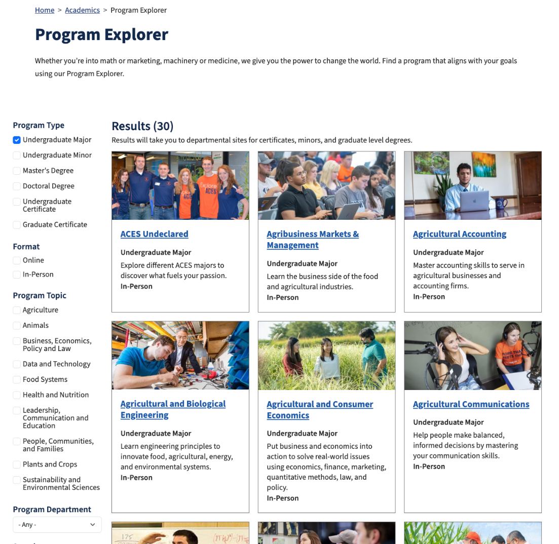
| Before | After |
|---|---|
|
|
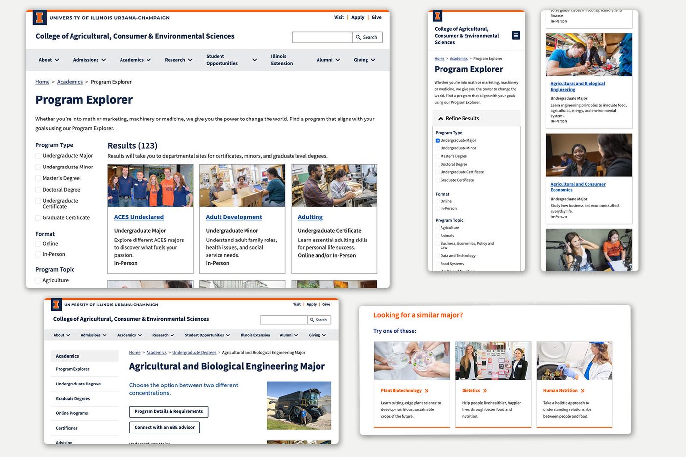
| No search, sort, or filter. The list was the interface. | Four filter groups that narrow together, with the result count announced on every change. |
| Expand an accordion to learn anything at all about a program. | Enough on the face of each card to compare programs without opening one. |
| Department first. A student had to know that food science lives in FSHN. | Ten interest areas as the way in. Department became a filter, not a prerequisite. |
| Learn more sent students to a departmental site and out of the flow. | Program detail opens inside the Explorer, with related programs beside it. |
Success
Privacy rules decided what success could look like
The college privacy policy blocked tying Explorer usage to applications or enrollment. That ruled out the measure people ask for first, so I set the bar where I could actually watch it happen: a prospective student who knows their interest but not the department should reach the right program area, and the catalog should be able to grow without another redesign.
Role
I designed the whole Explorer and directed the build
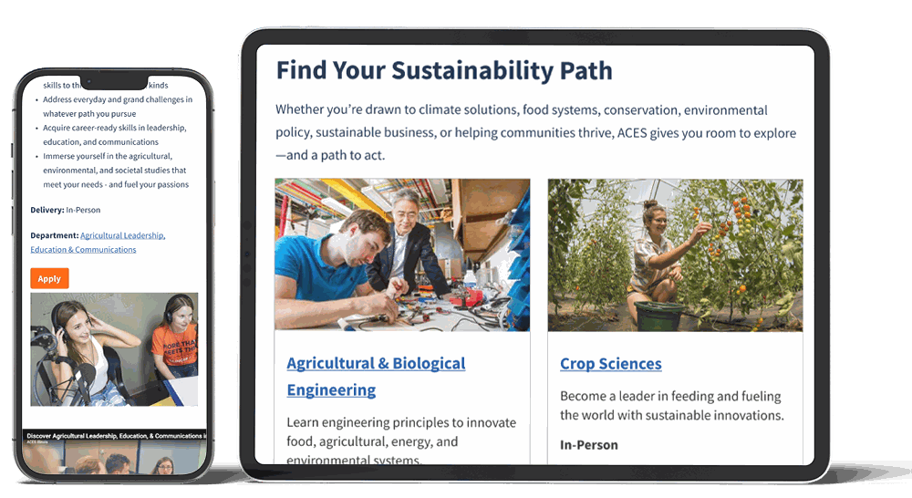
I designed the interaction model from wireframes through responsive behavior and content requirements, then directed two engineers through implementation.
The product tradeoffs that decided what shipped were mine as well.
Figure: One model at both breakpoints: filters narrow the grid, a card opens the program in place, and related programs pick the search back up.
Collaboration
A mapping workshop produced the shipped related-programs model
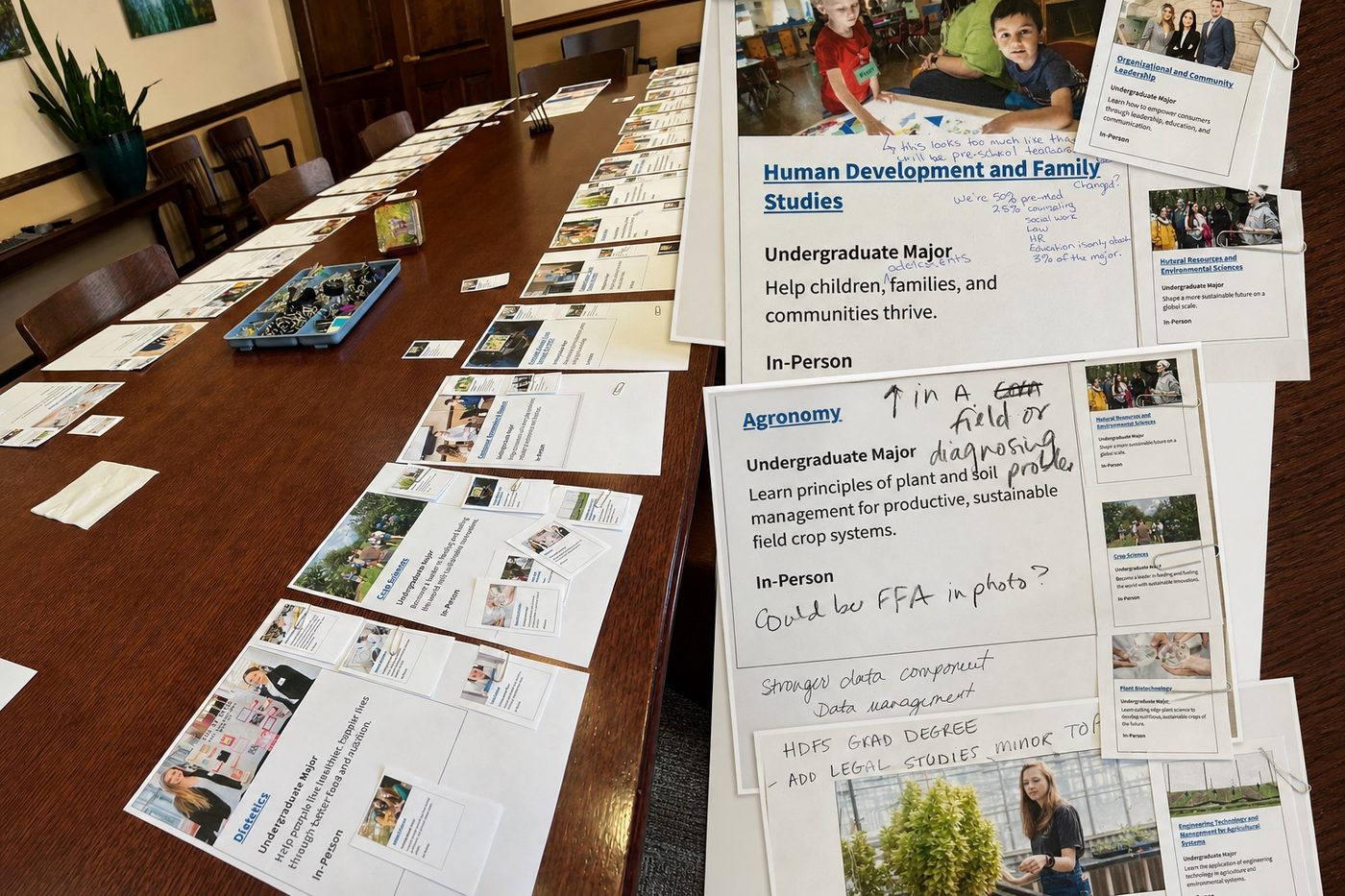
I ran a workshop where department representatives placed printed program cards on a table to find the connections that were real rather than assumed, like Agricultural Business for a student who arrived interested in business. The Dean took part, which gave the process authority and helped resolve disagreement.
A content-focused UX designer owned the program copy and kept it consistent across programs and department pages. A graduate assistant gathered images, proofread, and organized students for interviews. The interaction design and the information architecture were mine.
Approach
I tested whether interest categories matched how students searched
I treated the Admissions signal as a hypothesis, not a conclusion. Four inputs, and each one settled a different decision.
- Admissions conversations and recruiting eventsSettled the shape of the whole thing: an interest-first structure, not a cleaner version of the department list.
- Card sorting and tree testingChecked whether the interest categories were ones a prospective student could actually navigate. They became the ten interest areas the filters ship with.
- The related-programs workshopTurned assumed connections into the related-program associations that ship on every detail page.
- Competitive review of peer institutions, online-learning leaders, and the business college inside the universityShowed what a student needs to compare two programs at a glance. That decided what belongs on a card and what waits for the full program page.
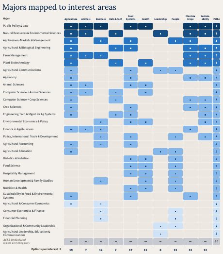
I mapped every major against every interest area
Major×interest matrix
Majors against the ten interest areas, with the number of paths into each.
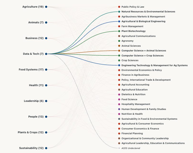
Interactive program-system views
Four views: the list problem, the interest-to-major relationship map, the department-by-interest structure matrix, and a sortable catalog.
System Design
One structured record powered the cards, filters, and detail pages
I specified a Drupal content model so program information lived in fields on one record instead of in hand-written page copy. Adding a program meant filling in a record.
Defined once
One program record
Title · Degree type · Department · Interest categories · Related programs · Image · Advisor contact · Apply link · Program detail copy
powered
- Browse cards
- Filters and sorting
- Program detail views
- Related-program sections
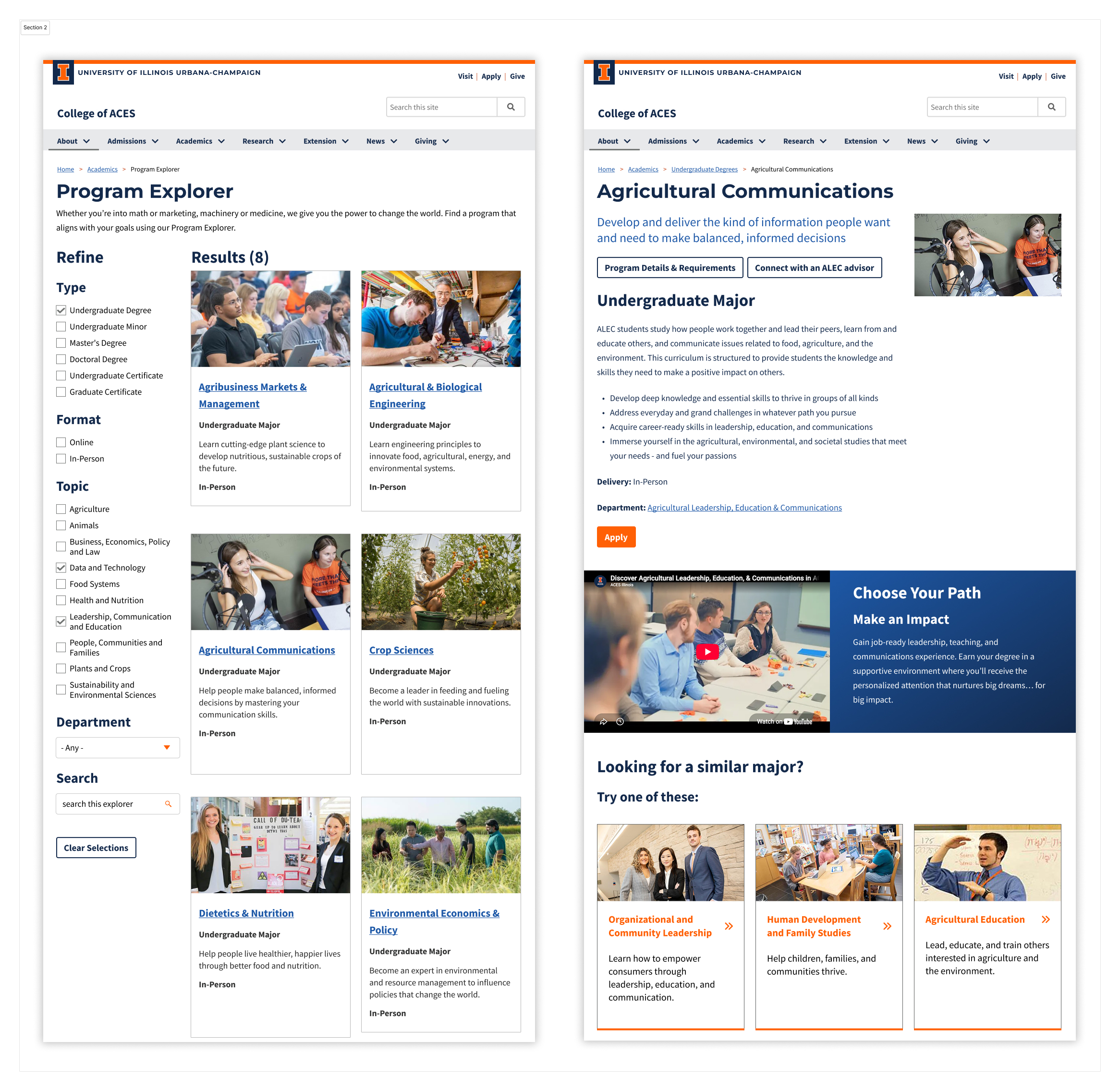
The same record ran a majors-only recruiting page
I also designed which parts of the record could be switched off for a given placement. For a Prospective Student Days campaign I embedded a majors-only version on the landing page, with minors, certificates and graduate programs hidden. No new build.
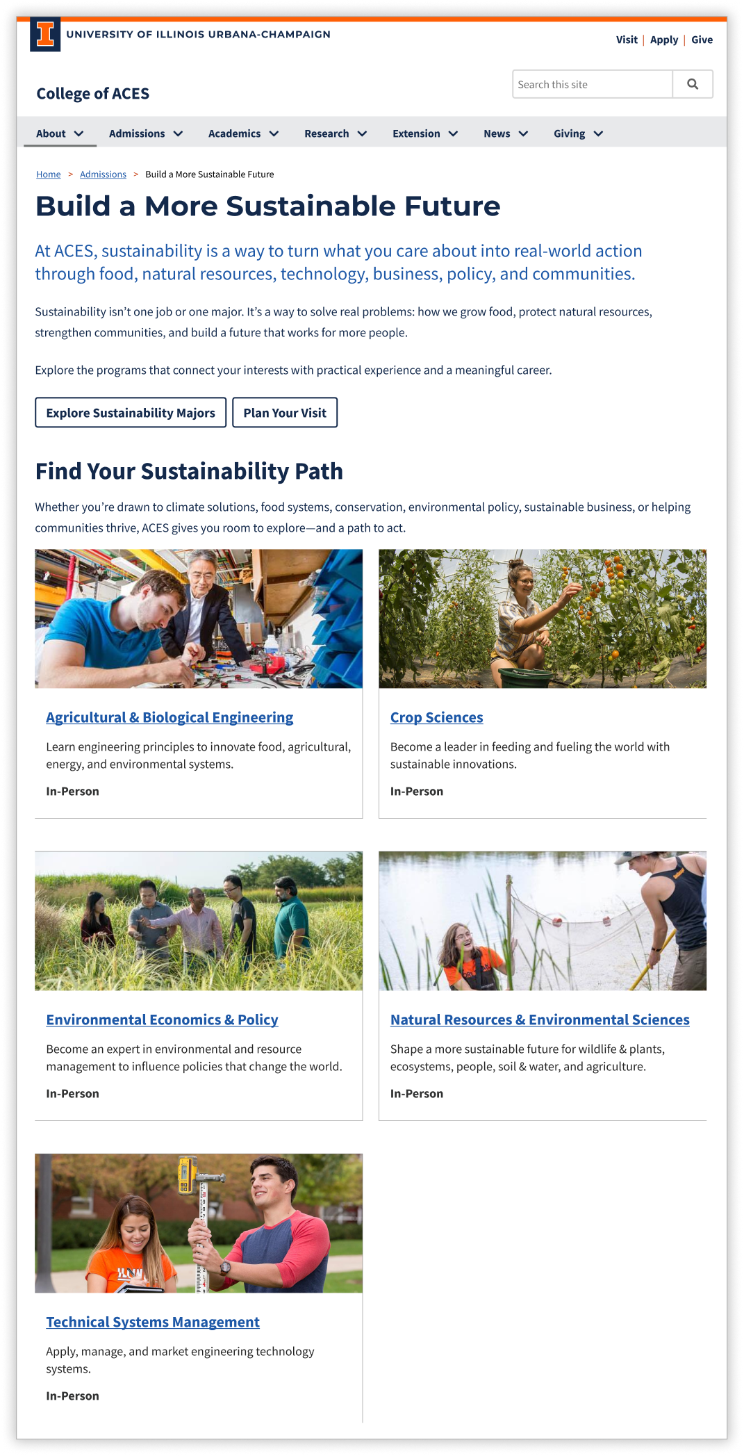
Wireframes and Prototype
I settled the filtering behavior before anyone built it
The filter rail, the result count and the card anatomy were decided in wireframes, in a shared Illinois component library, at mobile and desktop side by side.
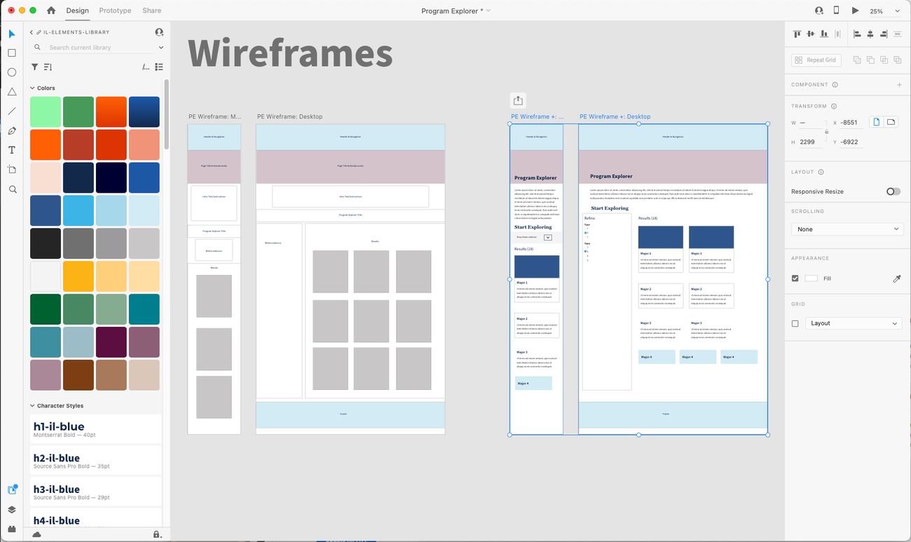
- Filters go in a left rail, grouped by the question a student is actually askingType, format, topic, department. Topic sits third because a prospective student can answer it without knowing the college. Department sits last because in the old site it came first.
- The result count sits above the grid, not beside the filtersIt is the answer to the filter you just changed, so it belongs where your eye lands next, not off to the side with the controls.
- The card is one link, not fivePhotograph, name, degree type, one line of description, format. A screen reader announces one program per card instead of walking every element inside it.
- At mobile the rail collapses above the results and the grid goes to one columnBoth breakpoints were drawn at the same time, which is why the card keeps the same five parts at every width.
- Filtering to zero is a designed stateOver-filtering ends on clear all filters and browse all programs. A result set of zero still has to go somewhere.
The final list only needed the degree names
The Explorer page was for students who did not yet know what ACES offered, so it needed filters and cards with enough information to compare programs. The campaign page above used a selected set of the same cards without filters. The main degree pages did a different job. They paired a list of programs with application information, dates and other page content.
I explored three treatments for that list view to see how much information each row needed.
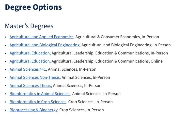
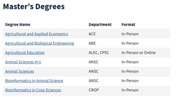
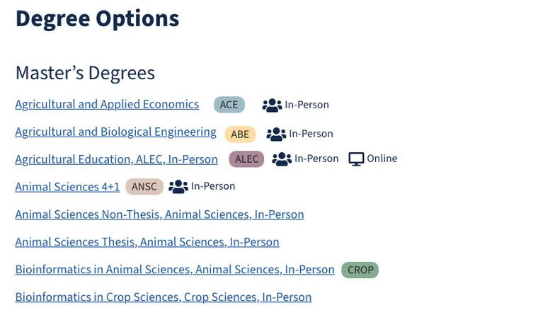
We built a simpler final version than any of these: a bulleted list of linked degree names, without department or format. The list pulled from the same program records as the Explorer. Staff could change a degree once instead of updating a second list by hand.
Keyboard and screen-reader users had to keep their place
Accessibility was in the interaction requirements from the start, targeting WCAG 2.1 AA. A design review by the Website Implementation Guidelines Group, the cross-campus web community I co-chaired, caught a filtering defect: every selection reloaded the page and sent keyboard and screen-reader users back to the top. I owned the fix. I specified AJAX filtering and directed the engineers who built it, tested it myself, and took it back to the group to test again. Results update without a page reload, focus is preserved, selections persist through browser back and forward, and the result count is announced.
Walk the five discovery flows
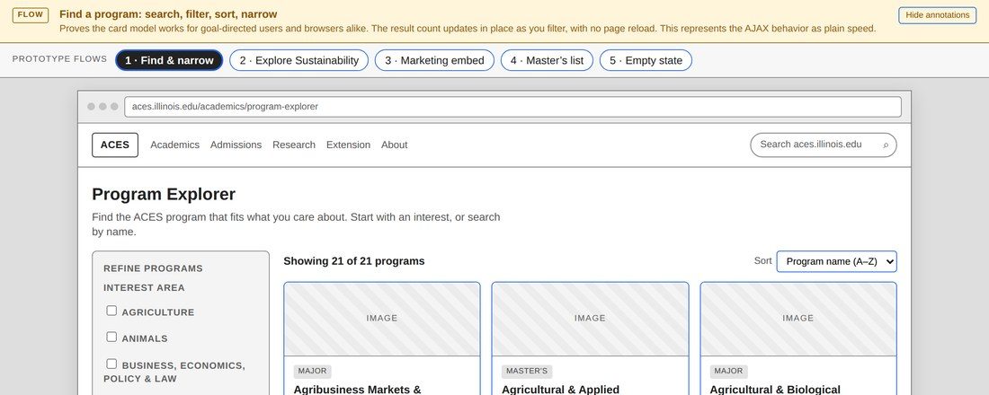
Program Explorer wireframe
Search and narrow, follow an interest into a program in another department, the majors-only campaign configuration, a standalone master’s list, and over-filtering to nothing. Low fidelity: interaction structure, not the shipped build.
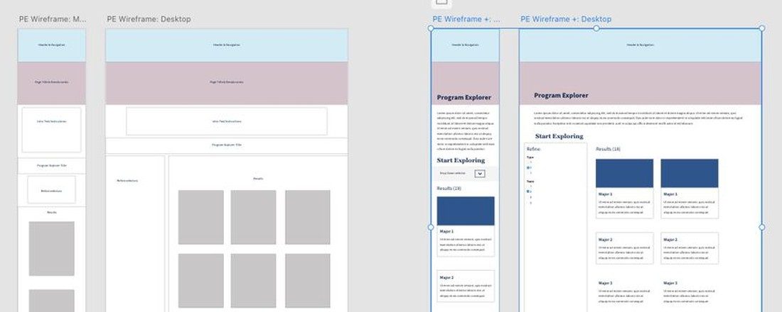
Wireframes and interaction design (opens in a new tab)
The wireframe set the prototype was built from: desktop and mobile, page by page, with the interaction notes beside them.
Tradeoffs
Concentrations went on the majors list as degrees, on purpose
Three majors carried concentrations that students, advisors and recruiters all treated as degrees in their own right. Some had been talked about that way for years. Others were partway through being restructured into majors, which takes years of university governance. Either way the majors list hid them.
Agricultural education is the clearest case. Everyone called it the ag teacher major, and the catalog had it as a concentration inside Agricultural Leadership, Education and Communications.
I put the discrepancy in front of Department Heads, the Dean, and recruiters instead of deciding it inside the interface. They agreed to surface those concentrations on the majors list, so the site matched how people already searched while the reclassification kept working through governance on its own timeline.
The site was accurate about how those programs were used and ahead of the record on how they were classified.
Outcome
The evidence supported discovery, not conversion
Neither the task result nor the session data establishes causation, and privacy rules kept applications and enrollment out of reach entirely. What both point at is people finding program areas through interests.
- 96%
- success and directness on one saved tree-testing task, finding a program through the interest-based structure
- 11,055
- Explorer sessions, with onward navigation into specific program areas rather than exits
Still live
Three years on, the Explorer runs in essentially the same public-facing form: the same ten interest topics, the same card grid, the same filters.
If I were measuring it today
I’d pair UX signals like task success and related-program click-through with operational ones like reduced advising load and the redesign work the structure kept avoiding.
The system’s value shows up in what nobody had to rebuild
A campaign page that would have been a second build is a configuration of the first one. Three years of catalog growth went in without a redesign, and the content stayed consistent because there is only one place it lives.